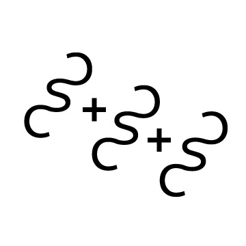
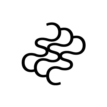
This logo’s puzzle-like design symbolizes problem solving and thoroughness. Its organic shapes show
freethinking and experimentation. Pulling inspiration from one of my favorite artists, M.C. Escher, my logo is formed from the negative space of my initials “C” and “S.” The colors are a combination of red, my childhood favorite,
and blue, my current favorite color. Together they represent my metamorphosis. This project taught me a lot about branding, as well as the process that goes behind it. A logo is not merely a shape or symbol. It is a personality.
Process


