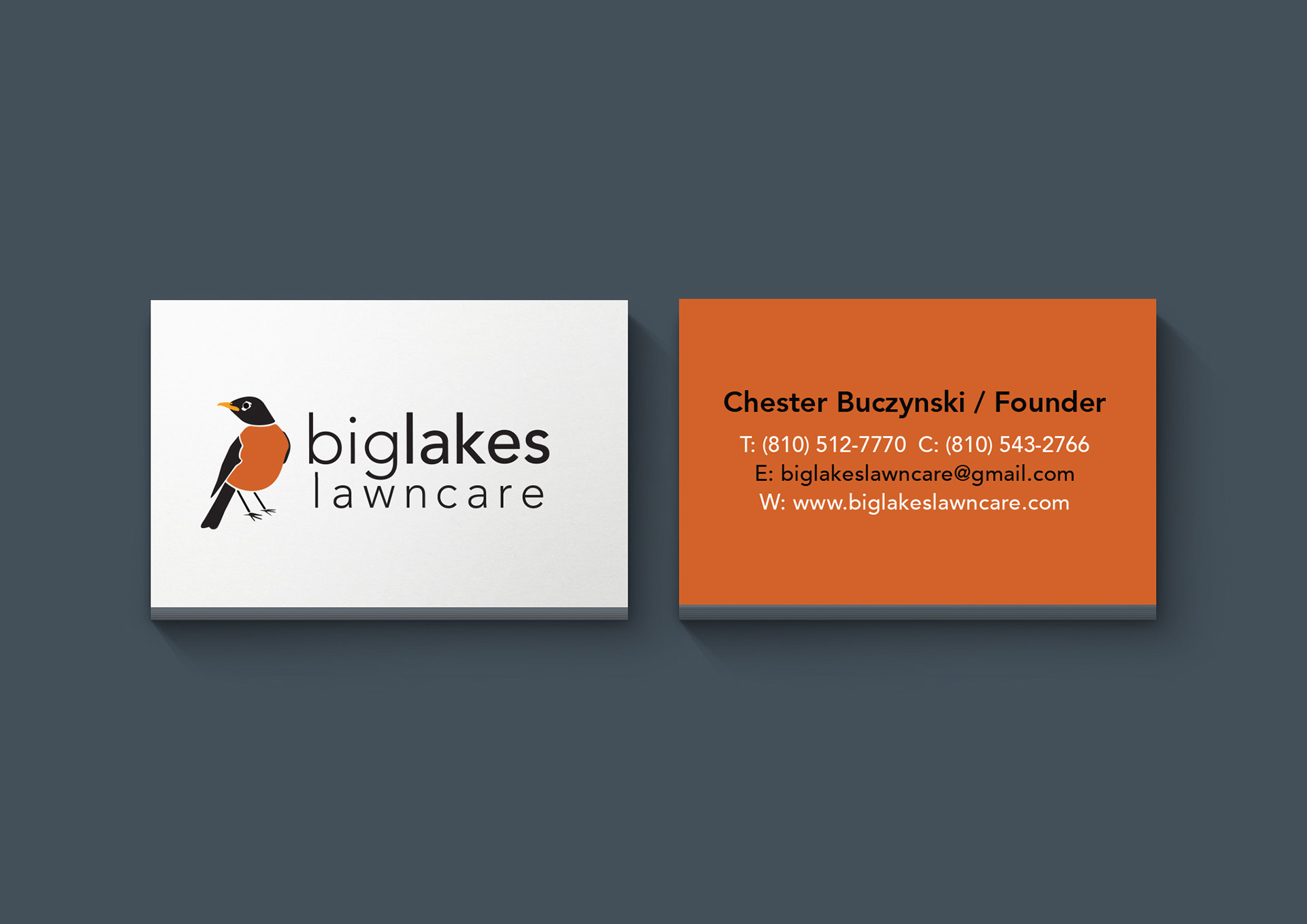
Biglakes Lawncare is a Michigan based landscaping company I did a complete re-brand for.
The owner, Chester, had a vision of a sort of mascot for his company with an animal-based logo. I then suggested Michigan’s state bird, the robin. Robins are commonly viewed as a symbol of spring, renewal, and are always on the scene of a freshly cut lawn. This provided a unique opportunity to create a color scheme that stood out against the typical lawncare branding. I chose to use bright orange and yellow so that the color would
be bold against the green of a freshly manicured yard.
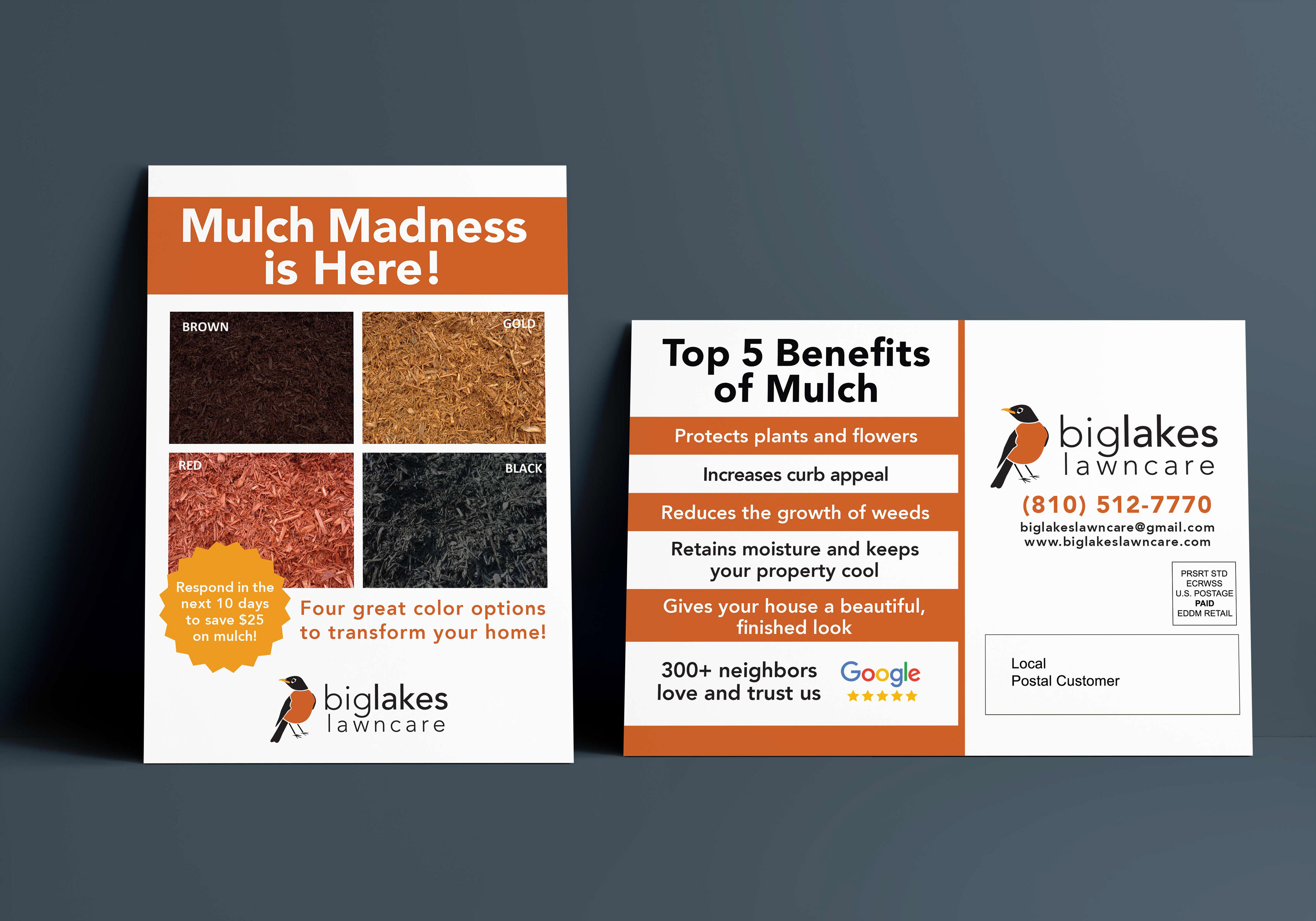
Within the rebrand, I updated business cards, the letterhead as well as created door hangers,
mailers, lawn signs, tee shirts, etc. for Chester’s company.
mailers, lawn signs, tee shirts, etc. for Chester’s company.


Overall, I learned a lot about branding and working with clients. My biggest take away from this project was how much impact a brand can have on a local business. It was a great feeling to be able to collaborate with Chester. Now every time his clients see a robin they can always thank Biglakes Lawncare.
